
Introduction
In today’s digital era, your business website is often the first interaction a potential customer has with your brand. Imagine walking into a store where the layout is confusing, products are hard to find, and the checkout process is a puzzle. Chances are, you wouldn’t stay long or return in the future. Similarly, a user-friendly website acts as your digital storefront, welcoming visitors and guiding them effortlessly toward what they need.
A well-designed, user-friendly website isn’t just a nice-to-have—it’s a crucial component of business success. First and foremost, it enhances customer satisfaction. When users can easily navigate your site, find information quickly, and enjoy a seamless browsing experience, they are more likely to leave with a positive impression, encourage others to visit, and keep coming back themselves.
Moreover, a user-friendly website boosts your search engine optimization (SEO) efforts. Search engines favor sites that provide a great user experience, meaning your site can rank higher in search results if it’s easy to use and navigate. This increased visibility helps attract more organic traffic, bringing you one step closer to achieving your business goals.
Finally, the ultimate benefit of a well-crafted, user-friendly website is improved conversion rates. When potential customers find what they’re looking for without frustration or confusion, they’re more likely to complete the actions you want them to—whether that’s making a purchase, signing up for a newsletter, or reaching out for more information. The path from visitor to customer becomes smoother, leading to better returns on your digital investments.
In this post, we’ll explore practical steps to design a business website that not only meets but exceeds user expectations, setting your company up for sustained success in the competitive online landscape.

1. Understand Your Audience
When it comes to designing a user-friendly website, understanding your audience is like laying the foundation for a sturdy building. Just as architects begin with a blueprint tailored to the needs and preferences of those who will inhabit the space, you must identify your target users and their specific needs. Who are they? What are their goals when visiting your website? The answers to these questions will guide every decision you make, from design to content.
Identify Target Users and Their Needs
Start by defining your target audience. This includes demographics such as age, gender, location, and occupation, as well as psychographics like interests, values, and pain points. Consider creating segments based on different categories of users who might interact with your business. For instance, if you run an ecommerce store, you might have first-time shoppers, return customers, and those who are merely browsing. Each group comes with distinct needs and expectations that your site must address.
Once you’ve identified these segments, delve deeper into their specific needs. Are they looking for quick information, detailed product specifications, or an engaging narrative about your brand? Are they tech-savvy millennials or seasoned professionals who prefer straightforward language and clear calls to action? Understanding these nuances will help you craft a website that resonates deeply with each user group.
Conduct User Research and Create User Personas
To truly grasp your audience’s needs, conducting user research is essential. This can take many forms, from surveys and interviews to analytics and usability testing. Use tools like Google Analytics to gain insights into user behavior on your existing site, examining metrics like bounce rates and time spent on pages. Pay attention to feedback from customers, whether it’s through social media comments, reviews, or direct inquiries. This real-world data provides invaluable clues about how users interact with your site and what they desire.
Once you’ve gathered sufficient information, transform it into user personas—fictitious representations of your ideal users. Each persona should encapsulate key characteristics, needs, challenges, and goals of different segments of your audience. For example, you might create a persona named “Budget-Conscious Brenda,” a savvy shopper always on the lookout for the best deals, who values concise product descriptions and prominent discount information. Or “Corporate Carl,” a busy executive who appreciates streamlined navigation and quick access to essential features.
By developing user personas, you create a vivid picture of your audience, allowing your design and content teams to align their strategies with real user needs. The personas act as a guiding star, ensuring that every element on your website—from layout to language choice—serves to enhance the user experience and meet the expectations of your audience.
In short, understanding your audience is not an optional step but a critical one in the design process. By diving deep into who your users are and what they need, you lay the groundwork for a website that not only attracts visitors but also engages and retains them, setting the stage for lasting business success.

2. Clear Navigation
Once you’ve established a solid understanding of your audience, the next critical element in creating a user-friendly website is implementing clear navigation. Navigation is the backbone of your website—akin to the signs guiding travelers on a well-marked road. If visitors can navigate effortlessly, they’re more likely to explore your offerings and, ultimately, convert into customers.
Keep Navigation Simple and Intuitive
The key to effective navigation is simplicity. Aim to create a straightforward pathway for your users, allowing them to find what they’re looking for without unnecessary complication. A cluttered navigation menu can overwhelm visitors, leading to frustration and, ultimately, abandonment of your site. Instead, streamline your navigation by limiting the number of menu items and focusing on the most important sections of your site.
Incorporate familiar symbols and icons that resonate with common web conventions. For instance, a magnifying glass icon is universally understood to represent the search function, while a shopping cart icon clearly indicates the shopping area of an ecommerce site. By using these intuitive symbols, you can enhance the user experience and lower the learning curve for less tech-savvy visitors.
Use a Logical Hierarchy with Clear Labels
A logical hierarchy in your navigation structure is essential to helping users understand the organization of your content. Each category should flow naturally into subcategories, making it easy for users to drill down to the specific information they seek. For example, if you operate a travel website, your main navigation might include categories like “Destinations,” “Travel Tips,” and “Booking.” Under “Destinations,” you can further break it down into regions, countries, or even specific cities.
Each label in your navigation menu should be clear and descriptive. Avoid jargon or overly creative names that could confuse users. Instead, opt for straightforward language that communicates exactly what users can expect when they click. If someone is looking for customer support, a clear label like “Help” or “Support” is far more effective than something vague, like “Assistance.”
Implement a Search Function
In addition to straightforward navigation menus, incorporating a search function can significantly enhance user experience. This feature allows visitors to quickly find specific content or products without having to sift through multiple pages or menus—ideal for sites with vast amounts of information.
Position the search bar prominently on your site, ideally in the header, where it’s easily visible. Ensure that it’s easy to use, providing results as suggestions appear, similar to autocomplete, which can reduce the effort required by users to find what they need. Additionally, consider designing the search results page thoughtfully, incorporating filters or categories allowing users to refine their query based on parameters like date, relevance, price range, or location.
Clear navigation, a logical hierarchy, and a powerful search function work together harmoniously to create a seamless user experience. By prioritizing these elements, you empower visitors to explore your site, discover valuable content, and ultimately convert into loyal customers. It’s all about removing barriers and guiding them along a straightforward path to success—both for them and your business.
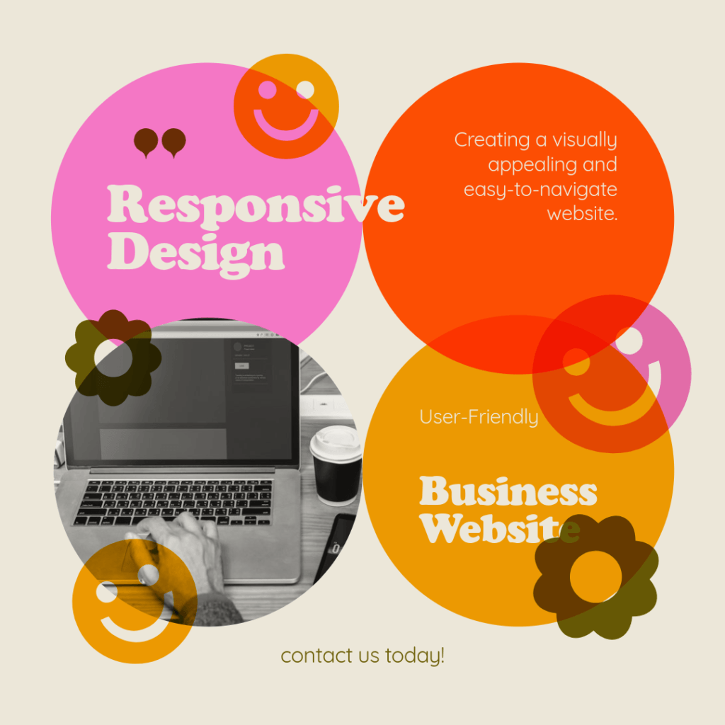
3. Responsive Design
Read more: How To Design A User-Friendly Business WebsiteAlright, folks, let’s talk about responsive design—also known as the magic trick that makes your website look fantastic on every device! You see, these days, people are glued to their phones like a kid to a candy bar. If your website isn’t mobile-friendly, you might as well be handing out “Do Not Enter” signs at an exclusive party.
Ensure the Website is Mobile-Friendly
First things first: if your website looks like a hot mess on a mobile device, users will abandon ship faster than a rat on a sinking boat. Let’s face it, nobody wants to squint at tiny text, zoom in to read a paragraph, or engage in a game of “how many times can I scroll before I find what I need?” Instead, your site should adapt smoothly like a Transformer—the cooler, non-awkward kind. Think of responsive design as giving your website a pair of stylish, adjustable glasses that make it look sharp whether on a phone, tablet, or desktop.
Everything from buttons to images should resize and reposition themselves like they’re on a dance floor, adapting to whatever space they’re in. And let’s not forget: mobile users are a unique breed. They have fingers that can be an inch wide or the size of hot dogs, so make sure buttons are big enough for even the clumsiest of thumbs to tap without accidentally calling Aunt Gertrude.
Discuss the Importance of Testing Across Different Devices and Screen Sizes
Now that you’ve got a responsive design, it’s time to put it to the test! Imagine if a superhero could only save the world from one angle—pretty pointless, right? That’s why you need to hit the ground running (or scrolling) and test your website across all sorts of devices and screen sizes.
You’re going to want to channel your inner Goldilocks here, trying out everything from Grandma’s old flip phone (because we all have one of those lurking in the drawer) to the latest high-tech gadgets. Get your website in front of every screen size imaginable. 5-inch? Check. 12-inch tablet? Check. Desktop monitors that look like they could double as movie screens? Double check!
Ultimately, it’s all about ensuring that your users have a delightful experience, regardless of how they access your site. If they have to bring out their magnifying glass or perform Olympic-level finger gymnastics just to find the contact page, you’re in trouble—big trouble!
Responsive design and rigorous testing will ensure that your website is a chameleon, gracefully transforming to fit any screen while keeping your visitors happy and engaged. A win-win situation! So get out there, test your design, and make sure everyone can shuffle around your virtual home as easily as finding the bathroom at a friend’s party.

4. Fast Loading Speed
Alright, let’s dive into the world of fast loading speed, or as I like to call it, the “Need for Speed” of the internet! Imagine this: you click on a link, and it’s like watching paint dry in slow motion. Not exactly the riveting experience you were hoping for, right? When it comes to your website, the faster it loads, the happier your visitors will be. Because let’s face it, in the age of instant gratification, no one has the patience to wait around for a website to load like it’s stuck in rush hour traffic.
Highlight the Importance of Page Load Speed for User Experience
When it comes to first impressions, your website’s loading speed is like that friend who shows up late to a party—nobody wants to deal with it! Studies show that if your site takes longer than about three seconds to load, it’s like a magician pulling a rabbit out of a hat only for it to be a sad old shoe instead. Users will bounce faster than a rubber ball on a trampoline, and you don’t want to become a distant memory on their history bar.
A fast-loading site not only improves user experience but also boosts your search engine rankings. Yes, Google loves speed. If your site’s as quick as a cheetah on caffeine, it can help you climb the ranks and attract more traffic. So, if you want to be the belle of the ball in the vast internet universe, speed matters!
Offer Tips Like Optimizing Images, Using Caching, and Minimizing Code
So, how do we go about making sure your website wins the speed race? Here are a few tips that are quicker than a New York minute:
- Optimize Images: Large images can be the biggest culprits in slowing down your website. They’re like that friend who always brings way too much luggage on a weekend trip. Make sure you compress your images before uploading. Use tools like TinyPNG or ImageOptim to zip those files up and set them free on the web! After all, nobody wants their photos looking like they belong in a 1970s slideshow!
- Use Caching: Caching is like a memory foam mattress for your website. It keeps a copy of your pages so that when a user returns, they don’t have to go through the whole load process again. It’s quicker and much more comfortable for everyone involved. Implement caching plugins (like W3 Total Cache or WP Super Cache, if you’re on WordPress) to help your site remember what to do!
- Minimize Code: If your website’s code is longer than a Tolstoy novel, it’s definitely time for a trim! Reducing the size of your HTML, CSS, and JavaScript files can shave off precious seconds. You can do this by removing unnecessary spaces, comments, and characters. Tools like Minify or UglifyJS can be your trusty sidekicks in this quest for speed.
- Choose a Reliable Hosting Provider: Your website’s hosting provider is crucial—think of them as the engine that powers your sports car. A slow host will make your website lag like it’s stuck in a traffic jam on a hot summer day. Choose a hosting company known for speed and reliability to give your site the turbo boost it needs!
By keeping these tips in mind and prioritizing fast loading speeds, you’ll ensure that your users have a seamless experience. They’ll feel like they’re cruising down the information superhighway in a Formula 1 car rather than stuck in a never-ending waiting room. Remember, speed is king, and in the digital world, it can make or break your visitors’ experience! So hit the gas and watch your website zoom ahead!

5. Consistent Branding
Alright, let’s talk about consistent branding—something as essential as a hot dish at a potluck in Minnesota! If you want your website to sing in perfect harmony rather than sound like a deconstructed jingle, consistency is key. It’s like having that one family recipe that just tastes better every time because you’ve perfected it over the years—this is exactly what you want for your brand!
Use Consistent Colors, Fonts, and Logos
First up, let’s discuss colors, fonts, and logos. Just like you wouldn’t wear plaid and stripes together (unless you’re making a bold statement that involves a sense of humor), your website shouldn’t mix and match branding elements that clash. Choose a color palette that represents your brand personality and stick with it! You wouldn’t want your website to look like a Minnesota State Fair booth that decided to throw a rainbow party, right?
Make sure the fonts you choose are easy to read and reflect your brand’s voice. If you’re going for a friendly vibe, maybe skip the sharp, formal fonts that make people feel like they’re reading a legal document. And don’t forget your logo—it’s your brand’s best friend! Use it consistently across all platforms so that no one forgets who you are, even after one too many cheese curds at the fair!
Maintain a Cohesive Brand Identity Throughout the Site
Now, maintaining a cohesive brand identity throughout your site is like ensuring every dish complements the main course at a family gathering—you definitely don’t want Aunt Mary’s mystery casserole next to Grandma’s famous tater tot hot dish! Everything on your website should feel like part of the same family, from your homepage to the blog posts.
Use the same colors and fonts across all pages to create a sense of unity. This will help your visitors navigate your site with ease and instantly recognize your brand, much like spotting a familiar face in a crowd at the Minnesota State Fair.
Consistency builds trust. If someone encounters different styles and colors on every page, they’ll feel like they’ve walked into the wrong party, don’t you think? You want your users to feel at home, knowing they’re in the right place!
Remember, branding isn’t just about looking pretty; it’s about creating an experience that resonates with your audience. When your website reflects a unified brand identity, it showcases professionalism and reliability. So, embrace your Minnesota roots and serve up your brand consistency hot and fresh, just like a good serving of cheese curds! Your visitors will thank you, and you’ll be on your way to building a brand that people love as much as a good winter festival.

6. Engaging and Relevant Content
Creating engaging and relevant content is crucial for any website aiming to attract and retain visitors. The quality of your content can significantly impact user experience and overall site success.
Provide Clear, Concise, and Valuable Content for Users
Start by ensuring that your content is clear and concise. Users typically skim content, so it’s essential to communicate your message effectively. Avoid jargon unless it’s industry-specific and your audience is familiar with it. Aim to answer users’ questions and address their needs right off the bat. Valuable content not only informs but also engages your visitors, encouraging them to explore further or take action.
Tailor your content to meet the needs of your target audience. Understand what information they seek and provide it in an easily digestible manner. This could include how-to guides, FAQs, case studies, or articles that resonate with their interests. The goal is to establish your website as a trusted resource in your niche.
Use Headings, Bullet Points, and Visuals to Enhance Readability
To enhance readability, structure your content with clear headings and subheadings. This allows users to easily navigate through the text and find the information they’re looking for.
Incorporate bullet points to break down complex information into easily digestible snippets. This not only makes it more visually appealing but also helps emphasize key points without overwhelming the reader.
Additionally, visuals such as images, infographics, and videos can significantly enhance user engagement. They break up large blocks of text and can help illustrate your points more effectively than words alone. Infographics, for instance, can simplify complex information and provide a quick reference that enhances understanding.
By focusing on creating engaging and relevant content and presenting it in a user-friendly format, you can improve user satisfaction, keep visitors on your site longer, and increase the likelihood of conversions. Quality content paired with effective formatting will elevate your website’s professionalism, making it a valuable resource for your audience.
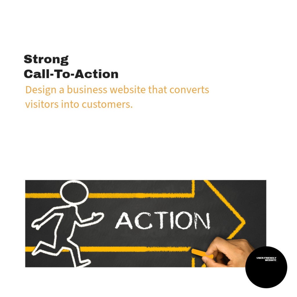
7. Strong Call-to-Action (CTA)
A strong Call-to-Action (CTA) is a critical component of your website, acting as a roadmap that guides users toward taking specific actions. Whether you want them to sign up for a newsletter, download a resource, or make a purchase, effective CTAs can significantly impact the conversion rates of your site.
Explain the Importance of Well-Placed CTAs
Well-placed CTAs are essential because they provide clear direction and encouragement for your visitors. Without CTAs, users might feel overwhelmed or uncertain about what to do next, which can lead to frustration and ultimately cause them to leave your site. A strategically placed CTA can help simplify the decision-making process and increase user engagement.
When CTAs are easily visible and contextually relevant, they become an integral part of the user experience. This means they should not only stand out visually but also resonate with the content surrounding them. For example, if a user has just read about the benefits of a product or service, a CTA encouraging them to “Learn More” or “Try It Free” will feel like a natural next step.
Provide Examples of Effective CTAs That Guide User Actions
Here are some examples of effective CTAs that can guide user actions effectively:
- “Sign Up for Our Newsletter” – Encourages users to stay updated with your latest content and offers.
- “Get Your Free eBook Today” – Offers valuable resources in exchange for user information.
- “Start Your Free Trial Now” – Invites users to experience your product or service without initial commitment.
- “Join Our Community” – Encourages users to engage and connect with others, fostering a sense of belonging.
- “Read Our Wealthy Affiliate Review” – If you’re interested in exploring opportunities for online business, this CTA invites visitors to dive into your insightful review, providing them with an essential resource that can guide their decision-making. Whether they are looking for a way to build passive income or want to expand their online presence, your review will offer them valuable insights that can help them make an informed choice.
Incorporating compelling CTAs throughout your website will not only guide users toward their goals but also help you achieve your business objectives. Always aim for clarity and relevance in your CTAs, ensuring they align with the content and context of your site. With well-designed CTAs, you can foster user engagement, drive conversions, and ultimately enhance the effectiveness of your online presence.
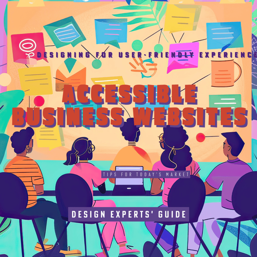
8. Accessibility
Making your website accessible is crucial for ensuring that all users, including those with disabilities, can engage with your content effectively. An accessible website not only broadens your audience but also promotes inclusivity and enhances user experience.
Discuss the Importance of Making Your Website Accessible to All Users, Including Those with Disabilities
Accessibility is about creating an inclusive online environment where everyone, regardless of their abilities or disabilities, can navigate, understand, and interact with content. This includes users with visual impairments, hearing impairments, cognitive disabilities, and other conditions that might affect how they use your website.
When a website is not accessible, you risk alienating a significant portion of the population, which can lead to dissatisfaction and lost opportunities. Additionally, making your site accessible is often required by law in many jurisdictions, as it aligns with principles of equality and non-discrimination.
By prioritizing accessibility, you demonstrate your commitment to inclusivity, which can enhance your brand reputation and build loyalty among your audience. Moreover, accessible websites often perform better in search engine rankings, as they typically provide a better user experience overall.
Mention Tools and Standards (Such as WCAG) to Ensure Accessibility
There are various tools and standards available to help ensure that your website meets accessibility guidelines. One of the most widely recognized standards is the Web Content Accessibility Guidelines (WCAG). These guidelines outline various criteria that help create accessible web content, including:
- Perceivable: Information and user interface components must be presentable to users in ways they can perceive. This includes providing text alternatives for non-text content, ensuring that audio and video content is captioned, and designing layouts that are easy to read.
- Operable: User interface components and navigation must be operable. This means that all functionality should be accessible via keyboard, and users must have enough time to read and use content without feeling rushed.
- Understandable: Information and operations of the user interface must be understandable. This involves using clear and simple language, consistent navigation, and providing help when users encounter errors.
- Robust: Content must be robust enough that it can be interpreted reliably by a wide variety of user agents, including assistive technologies. This can include proper use of HTML and ARIA (Accessible Rich Internet Applications) attributes.
To check your website’s accessibility, consider using tools like:
- WAVE: A tool to evaluate website accessibility.
- Axe: A browser extension that provides automated accessibility testing.
- Lighthouse: An open-source tool for improving the quality of web pages, which includes accessibility audits.
By following WCAG standards and utilizing these tools, you can enhance your website’s accessibility and ensure that all users, regardless of their abilities, can enjoy a seamless and inclusive experience. This commitment not only improves user engagement but also reflects positively on your brand and its values.
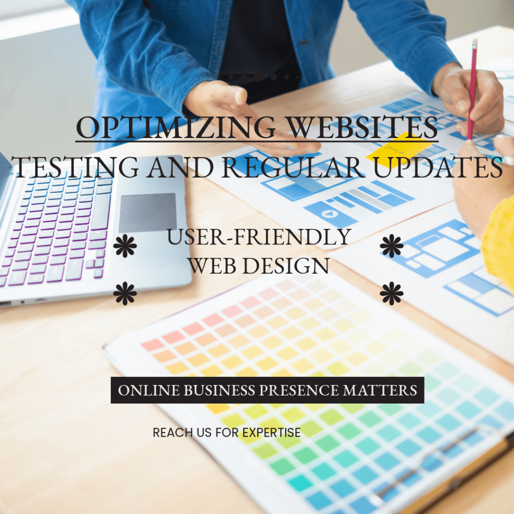
9. Regular Testing and Updates
In the dynamic world of web design, the only constant is change. To keep your website relevant, functional, and engaging, it is essential to embrace a culture of regular testing and updates. Just like any successful venture, ongoing evaluation and adaptation are key to maintaining a high-performing site that meets the evolving needs of your audience.
Emphasize the Need for Regular Usability Testing
Imagine launching a beautiful new website, only to discover, weeks later, that users are struggling to navigate it. Regular usability testing acts like a compass, guiding you through the complex landscape of user experience. By consistently gathering feedback from real users, you can identify pain points and areas of confusion that might not be apparent during the design phase.
Think of usability testing as a continuous conversation with your audience. Scheduling routine tests allows you to tap into their experiences and expectations, ensuring you are always aligned with their preferences. Whether it’s conducting A/B tests, user surveys, or observational studies, every bit of feedback is invaluable. Each session reveals insights that can spark ideas for enhancement, from streamlining navigation to optimizing loading times.
Moreover, regular usability testing shows your commitment to user experience. It demonstrates that you value your audience’s input and are dedicated to providing them with the best possible interaction on your site. As a result, users are more likely to feel recognized, respected, and, ultimately, engaged with your brand.
Stay Updated with the Latest Web Design Trends and Technologies
Just as the tides of fashion or technology ebb and flow, so too does the realm of web design. Staying updated with the latest trends and technologies is vital in keeping your website fresh and appealing. Imagine your favorite restaurant redesigning its menu each season to reflect current culinary trends—web design works the same way!
By keeping abreast of the latest trends, such as responsive design, immersive user experiences, and sustainable web practices, you can ensure that your website remains competitive and appealing to visitors. Following industry blogs, participating in webinars, and engaging with design communities are excellent ways to stay informed about emerging technologies and styles.
Additionally, regularly updating your site’s functionality can enhance performance and security. Implementing new technologies like progressive web apps (PWAs), chatbots, or even artificial intelligence can not only improve user experience but also position your brand as a forward-thinking leader in your niche.
As your site evolves, consider conducting periodic redesigns or refreshing content to keep your audience engaged and coming back for more. A static site can quickly become stale; regular updates breathe new life into your digital presence, making each visit to your site feel like an exciting experience.
In conclusion, embracing regular testing and updates creates a cycle of continuous improvement. By listening to your users and staying in tune with industry trends, you weave a narrative of growth and adaptation that resonates with your audience. This not only enhances user experience and satisfaction but also solidifies your brand’s trust and relevance in an ever-changing digital landscape. So, roll up your sleeves, and let the journey of continuous excellence begin!
Conclusion
As we wrap things up, let’s tie a nice bow on our web design journey! We’ve navigated through the intricacies of crafting an engaging user experience, from understanding the importance of user-centered design to ensuring our content is as accessible as a friendly neighborhood librarian. We’ve also touched on the significance of intuitive navigation that helps users find their way without feeling like they’re on a scavenger hunt.
We’ve dived deep into the well of aesthetics and functionality, discovering the magic that happens when your site’s look and feel complement each other like peanut butter and jelly. Not to forget the enlightening discussions on maintaining an accessible web environment for all users—the more the merrier, right? And of course, we concluded on a high note with the need for regular usability testing and staying updated with the ever-evolving trends and technologies in web design, ensuring you’re always the trendsetter rather than the trend-follower!
Now, I encourage you to be relentless in your pursuit of a stellar user experience. Just like a fine wine, websites get better with age—but only if you give them a cork to pop. So, keep your design processes fresh, iterate diligently, and continually seek feedback from your users. Embrace the spirit of improvement so your website can shine brighter than a freshly polished pair of shoes at a job interview.
Remember, in the world of web design, there’s always room for improvement—after all, the web keeps spinning, and so should your efforts! So, get out there and let your website be the toast of the digital town! Cheers to continuous improvement!